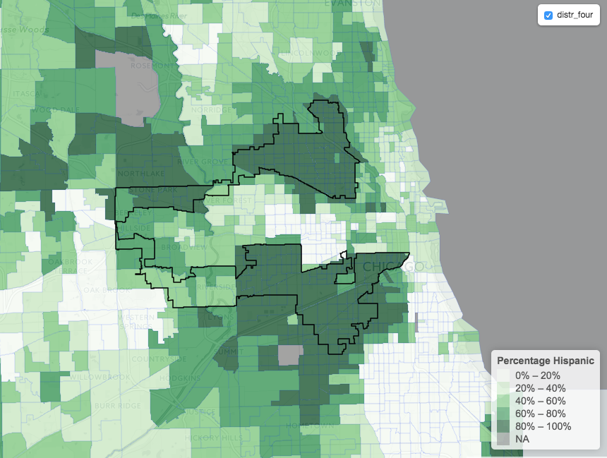
I’ll use R and Leaflet to present a particularly nasty example of gerrymandering: our beloved District Four in Illinois.
According to Wikipedia, “it was created to pack two majority Hispanic parts of Chicago into one district”, so let’s use the Census data to check how if the district is really following the ethnic borders.
If you’re unsure of what gerrymandering is or not convinced that it’s a big issue for democracy, then please read “the best explanation of gerrymandering you will ever see”
To produce a map, we need to prepare a geo dataset following these steps
- Get the census tract polygons
- Get the Census Data
- Merge census data with the polygons
- Get the polygons for District Four
- Use
leafletfor R to plot - (optional) Export to
.geojsonfor Leaflet
Get the census tract polygons
Thanks to the tigris package, this is incredibly straightforward:
library(sp)
library(tigris)
# Counties that overlap with district 4
county_list = c("Cook", "DuPage", "Will County")
ill_tracts <- tracts(state = 'IL',
                     county = county_list)
By default, these polygons will be from 2015.
Get the Census Data
I’ll use the percentage of hispanics in a Census tract. We need, by tract, a measure of the total population and one for the hispanic population.
R has a very convenient package called acs to download specific variables from different geographies. In this case I will download all tracts from our county_list
(You will need to get your API key from the Census, but it takes about 40 seconds to do it!)
library(acs)
# This only need to be done once!
api.key.install("your_key_here")

pop_hisp = acs.fetch(geo=geo.make(state="IL",
                county=county_list, tract="*"),
                endyear = 2010, dataset="sf1",
                variable=c("P0010001", "P0040003"))
sf1 and endyear=2010 means we are downloading the Census data for 2010. P0010001 contains the total population in a census tract, while P0040003 has hispanic population in that tract.
pop_hisp is an acs package object, which contains the estimates for our variables, plus the name of the State, County and Census tract (under geography).
Click here for the definition of all variables of the short form of the Census
Merge Census data with the polygons
We need to prepare pop_hisp a bit for the merge
col1 = pop_hisp@geography$NAME
col2 = (pop_hisp@estimate[,"P0040003"]
           / pop_hisp@estimate[,"P0010001"])
hispanic_df <- data.frame(col1, col2)
colnames(hispanic_df) <- c("NAMELSAD", "perc_hispanic")
hispanic_df is a data.frame with a percentage hispanic column and a NAMELSAD column that contains the Census Tract number. We’ll use this key to merge with the polygons contained in ill_tracts.
hispanic_merged = geo_join(ill_tracts, hispanic_df,
                           "NAMELSAD", "NAMELSAD")
hispanic_merge is a SpatialPolygonsDataFrame that is pretty much a data.frame augmented with a geometry of polygons. I haven’t used this package much, but the idea seems very similar to geopandas, which has taken extended pandas dataframes and extended (subclassing) them to include geometry.
Get the polygons for District Four
Once again, tigris comes to the rescue
cds = congressional_districts()

#Keep District Four from Illinois
ill_code = "17"
distr_four = cds[(cds@data$STATEFP == ill_code)
                 & (cds@data$NAMELSAD =="Congressional District 4") , ]
Leaflet Time
If you haven’t heard of it, Leaflet is a javascript library that makes it easy to produce stunning interactive maps.
R has a library by the same name to interact with the javascript library without leaving RStudio. This doesn’t expose all of Leaflet, but from the little I’ve seen it provides a lot of the basic functionality. Of course, if you want more flexibility you’ll have to use the javascript library directly.
Let’s make a choropleth plot with the leaflet R package to see if we’re on the right track
library(leaflet)

pal <- colorQuantile("Greens", NULL, n=5)

popup <- paste0("<span style='color:#7f0000'><strong>
                Percentage Hispanic: </strong></span>",
                as.character(round(hispanic_merged$perc_hispanic,
                                   digit=3)))

leaflet() %>%
    addProviderTiles("CartoDB.Positron") %>%
    addPolygons(data = hispanic_merged,
                fillColor = ~pal(hispanic_merged$perc_hispanic),
                fillOpacity = 0.7,
                weight = 0.2,
                smoothFactor = 0.2,
                popup = popup) %>%
    addPolygons(data = distr_four,
                fillOpacity = 0.,
                stroke=TRUE, opacity=1,
                weight = 1.5, color="black",
                smoothFactor = 0.5, group="distr_four") %>%
    addLegend(pal = pal,
              values = hispanic_merged$perc_hispanic,
              position = "bottomright",
              title = "Percentage Hispanic") %>%
    addLayersControl(
        overlayGroups = c("distr_four"),
        options = layersControlOptions(collapsed = FALSE)
    )

Click here for the interactive map
As you can see, the odd shape manages to merge two very large groups of hispanics and give them just one representative.
Export everything to GeoJson
You might want to work directly with the Leaflet javascript library, since it provides with more options and possibilities.
Leaflet read .geojson files, so we need to export the SpatialPolygonsDataFrame to .geojson.
This is pretty straightforward, but I ran into some issues with writeOGR complaining the file already existed, so I had to add a if exists: delete line.
library("rgdal")

# Export hispanic_merged
geojson_file = "hispanic_merged.geojson"
if (file.exists(geojson_file)) file.remove(geojson_file)

writeOGR(hispanic_merged, geojson_file,
        "hispanic_merged", driver="GeoJSON",
        check_exists=FALSE, overwrite_layer=TRUE)

# Export district four
distr_four_file = "distr_four.geojson"
if (file.exists(district_four_file)) file.remove(district_four_file)

writeOGR(dist_four, distr_four_file,
        "distr_four", driver="GeoJSON",
        check_exists=FALSE, overwrite_layer=TRUE)